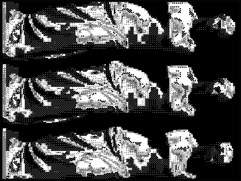
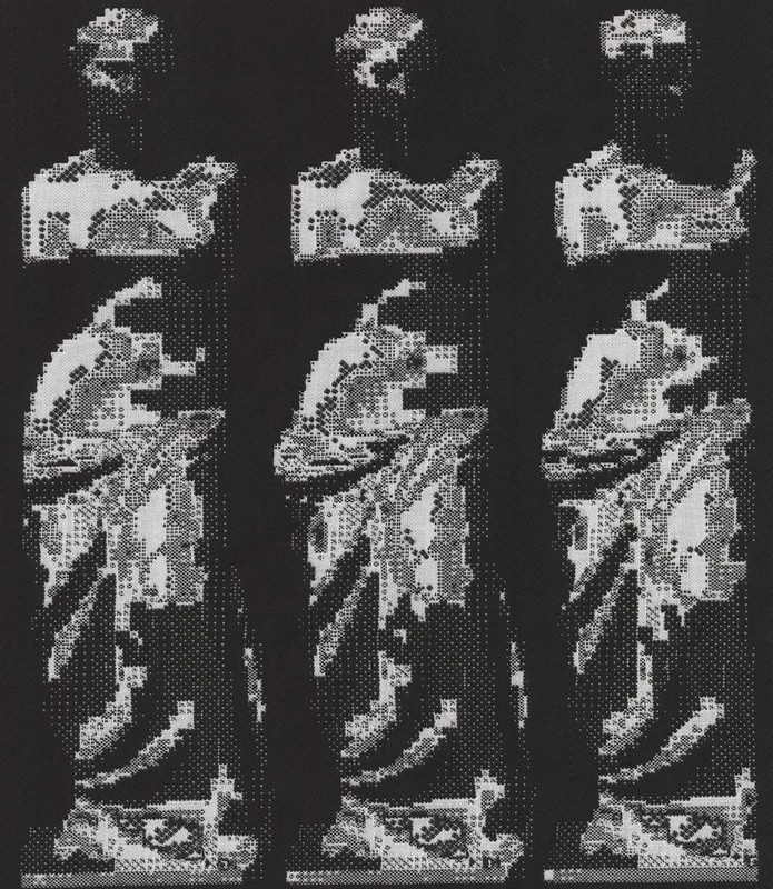
Submitted image (click to enlarge): Venus de Milo.
|
Submission title: Venus de Milo
Submitted by: William Davenport Participant’s field of work/interest: Unknown Participant’s Image Description: "This is several angles of a Venus de Milo. A variety of techniques and processes have been applied evenly and arbitrarily to make more visible the subtle changes of light and shadow falling upon this imaginary object. There have been re-iterative interference patterns and thresholds applied to the tone-curve." Translated and woven by Sophia Borowska. |
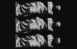
Pointcarré weaving simulation (click to enlarge).
Translation to WeavingWhat immediately became obvious when I started working with this image was that I would not be able to resize it at all without changing the image’s precise pixilation quite drastically. This led to an interesting task of figuring out how to weave the piece exactly to scale. There is usually a back and forth between resizing the image and testing the weave structures, but for this piece I had to develop all of the weave structures to work out to the right scale. It’s probably the best example of the scale and resolution shift between the screen and the loom, because the original image is matched pixel for pixel by the Jacquard threads. Since the submission is all about optics and interference patterns of pixels, I just tried to stay as true as possible to the stark white and black, and develop weave structures dictated by the patterns already present in the submission.
- Sophia |
Weaving structures - click to access full set of structures - available to WDRG members only.
Technique and Process Notes
I could tell right away that the plain black areas would pack down at a different rate than the busy areas in the middle, so I went into the pattern file and made the background a different colour. This allowed me to have two different structures that would appear as plain black: one more tightly packed with the white hidden behind, and the other one with a longer black float and the white disengaged. I had to do the same several times, adding another two types of structure for different areas of density in the white. You can see all the different colours in the working pattern file – the colour changes are based on the density of pattern in the area. Blue and black are both black in reality, and the pink, green and white are white. In the areas with black and white pixels interspersed very close together, the weaving is already being held together by the exchange of black and white on top, so using tight weave structures in those areas would create too much tension and distort the height of the pixel. I started with two wefts, a thinner white and a thicker black. But even with the different black structures, the background was packing down much more than the patterned areas. I added another thin black thread, and eventually got all the structures to pack at a similar rate.
- Sophia |
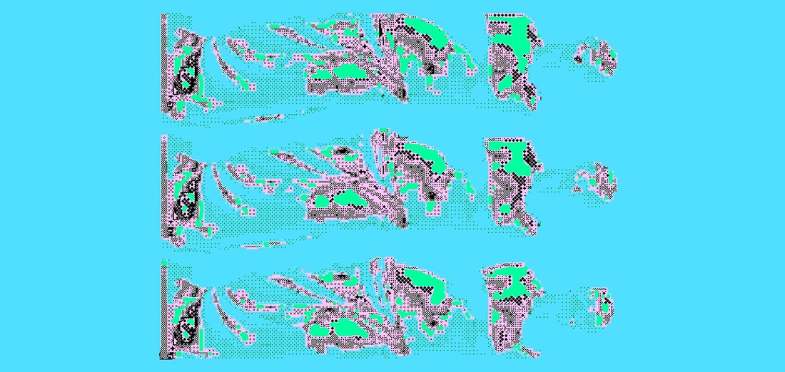
Colour reduction for weaving design (click to enlarge).
Outcome NotesThis was a piece that required lots of testing! Once it was taken off the loom, it looks just a tad too condensed, and the areas of white-on-black aren’t popping as much as in the image. When I weave the second copy of it, I will put more white weft on top for the lone white pixels, as well as beating a little less hard to get the ratios correct. All along I was trying to stop the patterns from elongating too much, but in the end I went too far and had the opposite effect. The challenge will be to keep the black background looking dense if I beat less hard.
- Sophia Original Dimensions: 1025 x 768 p Number of Picks: 2424 Woven Dimensions: 39” x 16.5” Weaving Density: 147 ppi (ideal would be 140) Threads Used: Warp is white 2/16 mercerized cotton. Wefts are 2/8 black cotton and 2/16 black and white cottons. |
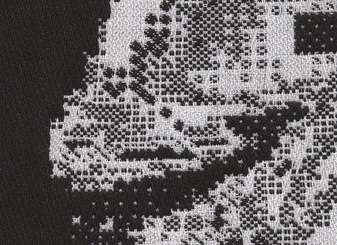
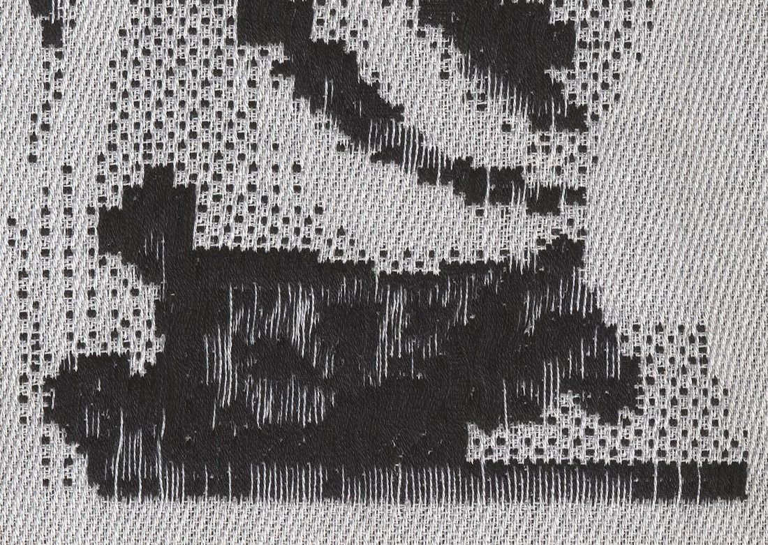
Images of Final Woven Samples
FRONT (ABOVE), BACK (BELOW).

|
|
DETAILS. Click to enlarge.