ARCHIVE: MEMOIRES DESUETES/ OUTDATED MEMORY
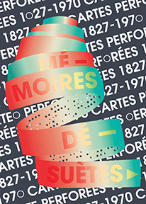
Submitted image: Mémoires Désuètes/ Outdated Memory
|
Submission title: Mémoires Désuètes/ Outdated Memory
Submitted by: Loïc Untereiner Participant’s field of work/interest: Graphic Designer Participant’s Image Description: “Punched cards, from looms to mass storage. With this poster, I want to interrogate the relation between the physical surface of weaving and design assisted by computers, as both have a common history with punched cards. First used to elaborate complex patterns in textile or music, they were the starting point of the transition from craft to industry. Punched cards were the first step to computers and are considered as the first mass storage system. The word "mémoires" in two parts on the poster (mé-moires) isolate also the word "moirés", phenomena seen on certain textiles." Translation and weaving by Sophia Borowska. |
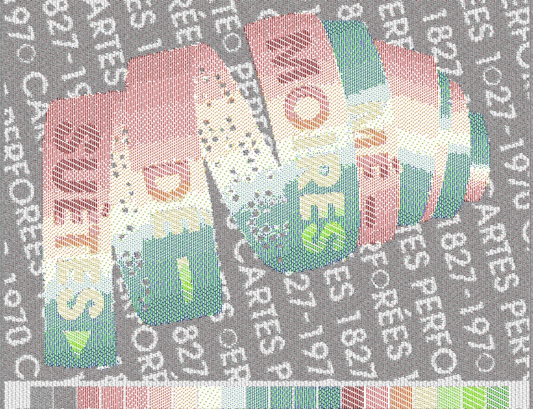
Pointcarré weaving simulation (click to enlarge).
Translation to Weaving
It was interesting to work with a graphic designer on translating what he calls a “poster” into woven form. Graphic design relies on sharp lines, high-resolution, clarity, flatness, and solid colours, effects virtually impossible to achieve on the Jacquard. The prospect of starting with an image only 288 pixels wide was a graphic design challenge in itself. But the colour gradients and floating punch-card design in the center provided an interesting point of departure away from flat poster towards a play of texture and surfaces. My goal was to make the spiraling punch-card raised and puffy on top of a tight, flat background.
-Sophia |
Structures (click to access structures - available to WDRG members only).
Technique and Process Notes
In order to highlight the textural difference between background and foreground image, I used double-weave with differential weft thicknesses. This means that I used a thin grey thread and a thick white thread, with the grey weaving two passes for every pass of the white shuttle. This allowed for higher resolution on the smaller background text, and looser weave structures on the punched-card. I hoped this difference would be especially apparent in the punched-holes where it shows through to the background. The colour gradients were achieved using only the warp threads, meaning that the lighter areas in the center are more weft-faced and raised off the surface, adding more allusion of three-dimensionality. In order to differentiate between the text on the card and the gradient behind it, we chose to use twill structures, which would highlight the outlines more than just a subtle colour change.
-Sophia |
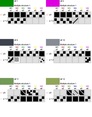
Colour reduction for designing weaving (click to enlarge).
Outcome Notes
Original Dimensions: 288 x 206 px
Number of Picks: 1458 Woven Dimensions: _______ Weaving Density: _______ Threads Used: Warp is 2/20 mercerized cotton, with a 6-colour warp rotation of black, red, green, blue, yellow, white. Wefts are 2/16 grey cotton and 2/8 white cotton. |
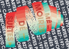
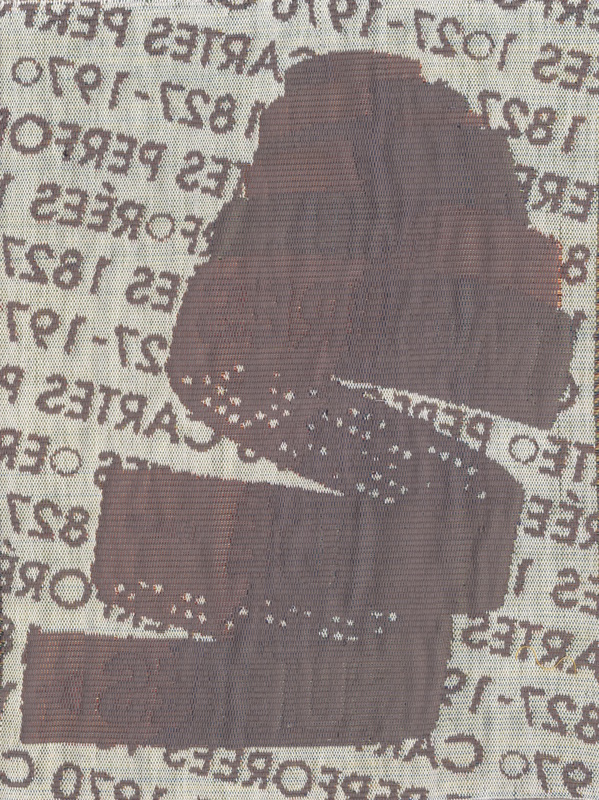
Images of Final Woven Samples
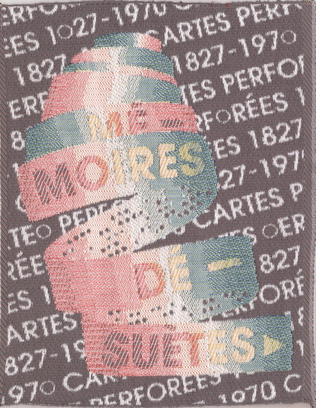
FRONT (ABOVE), BACK (BELOW).
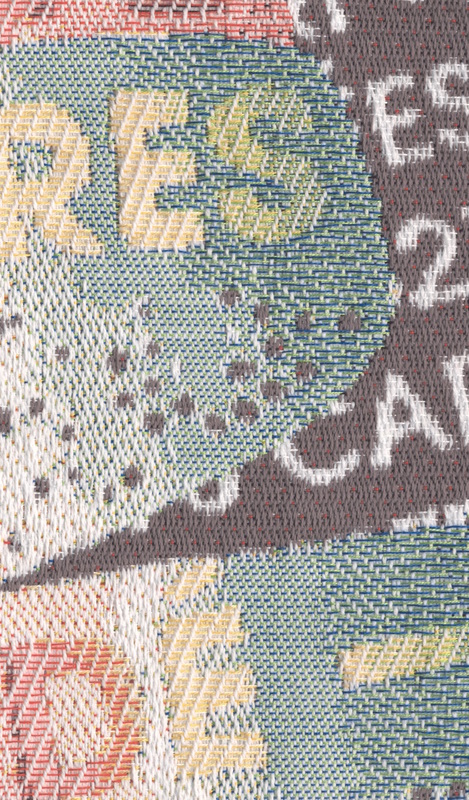
DETAIL (FRONT) - click to enlarge.
|
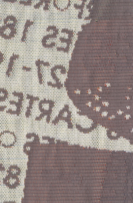
DETAIL (BACK) - click to enlarge.
|